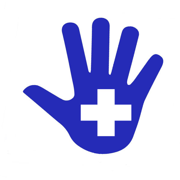
The graphic design logo Adapt is of a blue handprint with a medical cross in the middle, for an all inclusive universal symbol for people with health condition(s). Statistics estimate 80% of people with disABILITIES have an invisible health condition (and 45% of the population have a health condition) and yet when the word disABLEd or handicap is said the image of the white stick figure in a wheelchair come to mind. The current language utilized in society and by the medical community surrounding disABILITY identity can be perceived as negative and destructive to the human psyche. My view on disABILITY identity is as an “adaptation,” from stressors which have incurred in or on the body, either in utero or in life. The empowering language with positive connotation I’ve created are, “adaptation, adapt, adaption, handy (being skilled in your unique health condition), mindful health,” instead of “disability, mental, abnormality, dysfunction, handicapped, etc.,” allowing for people with health conditions to view themselves and others with health condition(s) as a human identity.

You must be logged in to post a comment.